Vet Clinic Case Study
UX design and research by Chloe Flanders
Second case study for the Google UX Design Certificate
the product:
Hickory Animal Clinic (HAC) offers quality and affordable healthcare to their patients. Users are typically pet owners between the ages of 18 and 65. I created a registration flow for Hickory Animal Clinic that is easy for patrons to use and for staff to quickly access patients’ information.
Tools used include Adobe XD and Photoshop
the problem:
Veterinarian clinics are in very high demand and have become expensive and inaccessible.
the goal:
Create a registration experience for new patients that is quick, easy, and accommodating.
my role: UX designer and researcher
user research
wireframing
prototyping
visual design
user research
My research consisted of user interviews, which I used to create a persona of a typical pet owner. Secondary research supports claims from the user interviews that getting quick medical care for their pets has become increasingly difficult. Many people have adopted pets because of the COVID-19 pandemic, with a third of those pets going to new pet households, as well as a third of those households being first time pet owners. With so many people adopting pet in such short amount of time, veterinary clinics have become very high in demand.
Users considered the following to be pain points
Vets aren’t accepting new patients
Vet clinics don’t have enough appointment slots, which creates a long waiting period for pet owners seeking treatment.
Staff are overwhelmed
Many people adopted pets during the COVID-19 pandemic, resulting in an influx of patients at vet clinics.
Vets are becoming more expensive
Pet owners are unable to financially compensate for certain services, with emergencies being the most prolific.
persona
Meet Angie. Angie is a college student living in Lexington with 2 roommates and her dog, Pecan. Pecan is the first pet Angie has owned by herself. Angie occasionally asks her roommates to keep an eye on Pecan, but doesn’t want to bother them all them time since they all have their own busy schedules. As finals week draws near, the household becomes more and more stressed. Angie notices one day that Pecan hasn’t been acting like herself, and is becoming more worried.
frustrations
Angie has a very limited schedule
Vets are in very high demand
goals
Book a vet appointment for Pecan quickly
problem statement
Angie is a dog owner and college student preparing for finals week who needs to schedule a vet appointment ASAP because she is exhausted from being anxious about both her dog and her grades.
wireframing
Since the user’s objective is to register their pet for an appointment, I used a sequential sitemap to guide them through the process
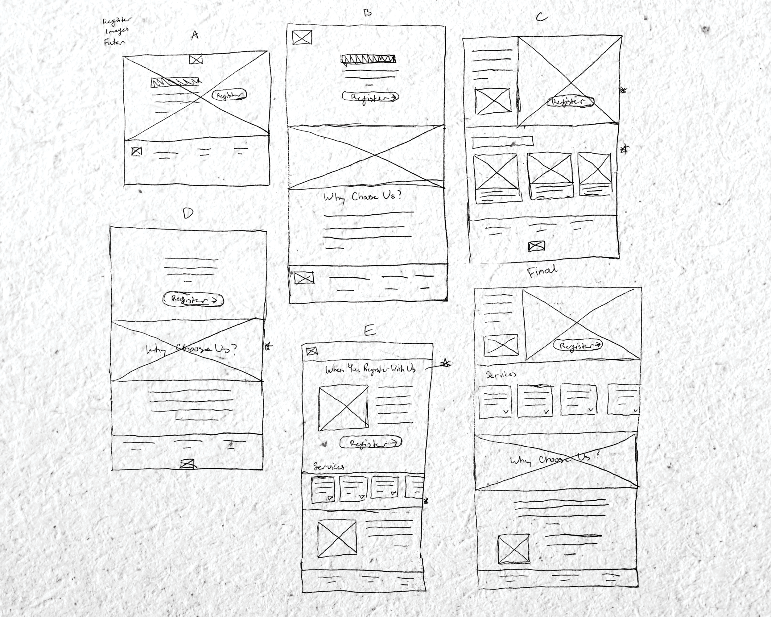
In order for users to get a quick preview of services before they registered, I created a horizontal scrolling service menu on the home page. Other ideas I liked are marked with stars to the right of them.
After I finalized the homepage layout, I moved on to transferring this to a mobile screen for the website to be fully responsive.
Moving from paper to digital, I began to see other areas that could improve user experience in the website. I began to ideate different solutions to make the user flow simple but still allow for various ranges of information being input.


The next step I took was to conduct a usability study. Two factors defined the results of the study:
2
Users were frustrated by limited functionality in the prototype
1
Users were confused when not given instructions to fill out a field
mockups
Based on the insights from the usability study, my goal was to focus on the functionality of the website. Like here, as users scrolled to the bottom of the home page, they had to scroll all the way back up to register. My solution was to include another registration button at the bottom of the home page that takes users to the same registration page.


Accessibility Considerations:
used headings with different sized text for clear visual hierarchy
included icons to help users navigate the website
included the option to leave a voice message
The impact:
The target users of the website shared that it was easy to use thanks to improved functionality, clear labeling, and visual hierarchy.
What I learned:
Each user is a different individual with their own specific needs. Getting to know these needs not only helps to design a better website or app, but it also allows you to connect with users and individual persons.
Thank You!
Thank you for reviewing my work for the Hickory Animal Clinic responsive website :)


